|
||||||||||||||||||||

|
ABOUT THE NEW
SERVAS INTERNATIONAL LOGO
The original Servas logo was created many years ago and has been modified several times. Over time many Servas member countries have abandoned that logo for designs of their own. Today over 20 designs represent the image of Servas presenting an overall lack of visual unity and an inconsistency throughout the organization.
A logo is a visual representation that helps define the personality of a non-governmental organization, movement, company or other organized body. It should look professional, present the proper image of the organization, and it's unique look should create a memorable and lasting impression on the viewer. A logo should also be a unifying element that sets an organization apart letting it stand out from others that are similar.
With a new Servas web site on the horizon there is no better time to re-establish Servas' position as a global, non-profit organization with a long tradition of promoting a more peaceful world using hospitality exchange as it's core feature.
The Design
This proposed new Servas Logo was developed over several months by two very experienced designers who are also Servas Members. Many designs from similar and competing organizations, as well as the various designs developed by Servas member countries, were reviewed for reference and, of course, the current goals for the future of Servas were considered.
The Image
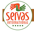
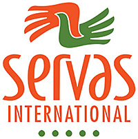
What's the image all about? Is it hands? Is it doves? Well, it's both and it's all in how the viewer wants to see it. Doves, of course, are symbolic of peace and the grasping hands suggest meeting, greeting, friendship, and the forming of new relationships. It's a symbol that's both unique and memorable.
The Logotype
The logotype for SERVAS is a modified version of the Bodega font. It was selected for it's simplicity, clean lines and it's feeling of strength and stability without being overbearing.
The Five Dots
The five dots represent the five inhabited continents - similar to the rings of the Olympic symbol - and symbolize the world-wide membership of Servas International.
The Colors
Why orange? Orange is generally considered a warm and joyful color. In Western cultures orange is thought of as "welcoming", "affordable", and a sign of "harvest". In Eastern cultures orange is a sign of "happiness", "spirituality". In India orange is a "sacred" color. Orange can also convey positive connotations such as "wisdom", "energy" and "playfulness". The right color balance was critical. Too red and it's becomes strong and dynamic. Too yellow and it appears soft and passive.
Why green? Green, very much a color of nature, represents "new birth", "spring", "growth", something to which we think all Servas members can relate.
We hope Servas member countries will accept this new design and incorporate it into their own web site and/or social media pages. But, most of all, Servas member countries are encouraged to begin working together for a more unified visual identity for Servas. The future of Servas may depend on it.
|